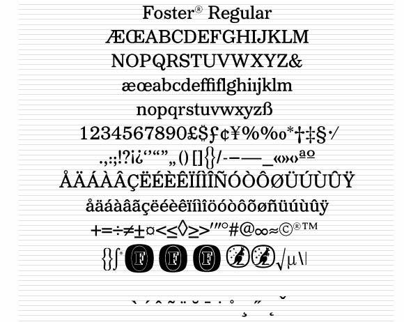
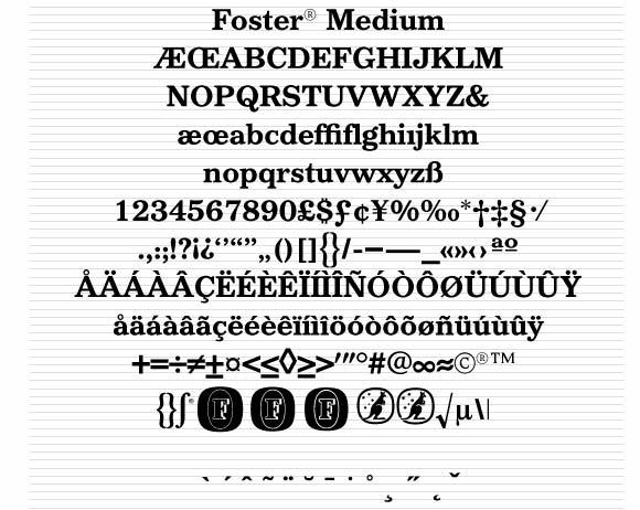
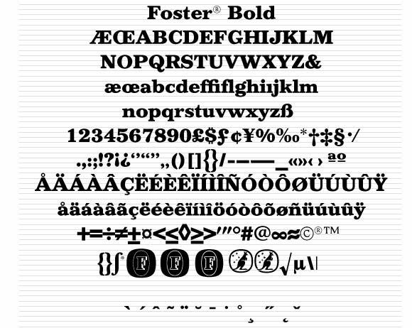
Three weights designed in 1989 by Adrian Williams. Commissioned by John French at The Quite Extraordinary Design Partnership. |
||
Copyright Carlton & United Breweries 1989. |
||


®
fonts by Adrian Williams
CASE STUDY: FOSTER'S® LAGER
Brief
FOSTER'S was a well known brand of Australian Lager Beer in need of a stronger and more coherant identity. The design agency explored with us the possibility of creating a whole typeface based on a single word - FOSTER'S. The agency briefed us on all of the various uses to which the typefaces were to be put. Many kerned pairs would be needed to give consistent typeset material across all weights. Logos would also need to be incorporated for typeset work with any fonts.
Solution
We decided to produce weights to cope with the difficulties of aluminium container printing, labels, packaging, advertisng et al. A strong Regular, a Medium and a Bold weight were approved, test words shown and fonts were produced. A travelling exhibition of the hundreds of hours work required was shown at the Institute for Performing Arts (IPA) in The Mall, London, where Adrian Williams was a guest speaker.


Font Ranges |
About |
Support |